In my previous post I looked at the Squapax website and mentioned a videos page where people had made aquapax virals before. I will post some examples here and analyse a few of them to see what they did right and what I think they did wrong.
The Reign of Plastic is Over
This video has a good, humorous idea. The man being bombarded by bottles isn't too out of place with a lot of YouTube virals. The pacing, however, is too slow. The idea doesn't get started for a while and while it is trying to establish a scene... that isn't something virals do. It's not snappy enough to get attention immediately. It is very well shot and mostly well executed but by the end becomes a regular advertisement.
Aquapax Eco friendly Advert
As the name says, this is a straight up advertisement. It contains impressive and visually splendid imagery but is not very compelling and certainly not something that would be shared by people.
Aquapax Viral - Ultimate Throwing
This is one of my favourite videos for Aquapax. The content is simple. Throwing bottles in a bin. It is consistent with the message and the way it is shot is impressive. It is of course fake but not obviously slow, except for how unbelievably good at throwing the people in the video are. It has a good hook. The pacing could be better, but it has 2 fundamental problems. The first being the name. Naming it a viral highlights it as such and might put people off because it's trying too hard. The other problem is at the end it becomes at bad advertisement. The aquapax angle feels shoehorned in and ruins the viral element.
Guy gets hit by car FAIL
This one is shot in an overly amateurish style to make the payoff at the end more convincing. It is let down by feeling overly fake, but has viral elements. The problem is that it doesn't paint Aquapax in a great light. Getting hit by a car is not pleasant.
She likes it on the rocks
This video benefits from being short, and the pay off at the end is good but the build up is too long and overly repetitive. The camera is too far away to get a clear picture of what is going on. She is drinking, but you cannot identify what from that distance.
Cassius - I Love You So (Blue Man Droplet Remix)
This idea works really well. A lot of virals revolve around song performances. The aquapax angle is too shoehorned in. The idea of the video being blue like Aquapax is good but it doesn't work with the awkward product placement.
120fps water stamp
This video could be 1/4 of it's length but it has a good idea. Watching water explode at 120fps is impressive, even though it isn't particularly well shot.
Chatroulette Funny Blue Man - Droplet
This video works very well. It is humorous, unique, entertaining and varied. It shows interaction with people which is always exiting. The only real problem is lack of integration with Aquapax.
Flaming Felsenquelle
This is funny, awkward and entertaining. There is little to do with Aquapax, but it creates intrigue and isn't very long. It is to redirect you to something more, which is a good form of campaigning.
Friends dad caught cross-dressing!
This idea, though slightly shameful and embarrassing captures what most of todays virals do best. The product is only lightly integrated and has a humorous payoff, likely to be shared around.
*NEW* Westwood - *EXCLUSIVE* Ludacris Rap Parody - What's Your Fantasy
This is my favourite of the aquapax videos. It works on a lot of viral levels. It is a parody, it's a music remix, it's not very long and it is funny. Aquapax is subtly integrated in a very good way that keeps it viral.
Research: Aquapax
As well as Virals, research in to the existing brand is a vital part of my pre-production.
JustDrinkingWater
justdrinkingwater.com is the official website of Aquapax. The visual style is very consistent with the packaging. Focusing on blue to associate it with water, and using the same graphics (illustration of a tree and birds).

There is a vast amount of information on the site about Aquapax, the business behind it, where you can buy it. Here are some small sections that I found interesting/relevant.
Every page serves to reinforce the environmental messages associated with Aquapax. He is very much posing this as a 'revolution', explicitly so in the last paragraph.
Videos
The website has several Aquapax ads on a video page embedded from Youtube to spread viral awareness of the product. None of them really feel like virals though, they all inevitably act as an advertisement for the product.
JustDrinkingWater
justdrinkingwater.com is the official website of Aquapax. The visual style is very consistent with the packaging. Focusing on blue to associate it with water, and using the same graphics (illustration of a tree and birds).

There is a vast amount of information on the site about Aquapax, the business behind it, where you can buy it. Here are some small sections that I found interesting/relevant.
Our Vision for Aquapax Pure Natural Mineral Water
To satisfy people’s needs for environmentally aware, unpretentious, truly pure, portable water.
Our Mission – (you have to have a mission!)
To develop a sustainable business with a minimal carbon footprint, packaging, marketing and selling portable clean pure drinking water. To share our company profits Justly, to create positive change for people who are least able to help themselves.
Join The Revolution
Aquapax is all about making a positive change to the way we consume portable water. A responsible package and a carbon balanced footprint makes ecological sense. You can also re-use and recycle your empty Aquapax carton after you’ve finished drinking from it. For more information about Aquapax why not read our founder’s blog or to join our revolution follow us on Twitter and Facebook.
Every page serves to reinforce the environmental messages associated with Aquapax. He is very much posing this as a 'revolution', explicitly so in the last paragraph.
Videos
The website has several Aquapax ads on a video page embedded from Youtube to spread viral awareness of the product. None of them really feel like virals though, they all inevitably act as an advertisement for the product.
Research: New Virals
Virals are constantly evolving. They come and go, and new ones are born all of the time. The most recent popular virals are different from those that were popular 4 or 5 years ago. Here are some recent ones.
Down On Me(With Me And 50 Cent)
This is one of many virals of people lipsyncing to someone else's song but its funny because it's a child and the actual artist makes an appearance in the video. It promotes the artist and song in a funny and charming way.
Rebecca Black - Friday
This was a pop song released in an entirely serious manner, but because of it being so aggressively awful the internet picked up on it as a joke and have shared it around. Despite the comments of how shallow the lyrics are, and how bad the quality of the video and singing are it has received over 146million views! That's crazy. No doubt it is awful, but it is awful to a degree that it's funny and makes people want to show other people how awful it is.
Annoying Orange
Annoying Orange consists of a man's face edited on to an orange, being annoying, talking to different fruit. Despite being annoying the interactions are funny, and this is a video series that regularly gets over 20million views per video. The quality of the effect is passable, but the idea is absurd enough to get recognised.
Gingers
This started off as a video blog from an annnoyed ginger kid who got angry on camera about people saying ginger people don't have souls. The person's appearance and disposition as well as his 'performance' have made it a comedy hit throughout the internet. and have spawned several parodies (even from famous TV shows like South Park:
Down On Me(With Me And 50 Cent)
Hide Your Kids, Hide Your Wife
This viral spawned from a funny interview segment on TV that has been remixed countless times.
Old Spice
This is one of my favourites and one of the most successful viral series for a product. It is funny, entertaining, well produced and sells the product very well. It features a lot of effects that I would not be able to produce but the idea is lavish, outlandish and funny.
Research: Classic Virals
Here are some examples of successful virals on the internet, both meme's and actual ad campaigns.
Afro Ninja
The success of this video is on it's comedy value. Much like 'You've Been Framed' it is funny to see people have accidents and hurt themselves in a way that isn't serious.
Bear Fight
This is an ad for John West Salmon. Again, it uses comedy but in a much more over the top way and is obviously set up (as opposed to being 'home footage' like afro ninja) but the absurdity of the situation as well as the way it is performed makes it very funny.
Laptop Butt
This is another ad, but for a Sony laptop. The product is shown but barely mentioned. Instead the focus is on the action. It is a combination of impressive feats plus ridiculous comedy. Two very compelling viral combinations. It has nothing to do with the product, yet the video is very popular.
Numa Numa
Don't underestimate the entertainment value of watching a fat person on youtube lipsyncing to a pop song. This is one of the most successful virals of all time and has spawned many clones. It isn't trying to sell anything, just silly comedy.
What is Viral?
In order to create something that is viral and not a regular advertisement I must first understand what a viral is.
I did a project in early 2010 that focused on producing a viral video, but it was much less an advertisement and more an infomercial or a piece of content designed to influence behaviour. For this I did some research in to what makes a virals and on the project I learnt a lot so I thought it would be useful to take another look at that blog with the hindsight I gained from what I had produced then, and also to refresh myself on the core concepts of viral media.
Old Research
I found some interesting sources in my research:
Wiktionary lists it as:Nounviral (plural virals)1. (marketing) A video, image or text spread by "word of mouth" on the internet or by e-mail for humorous, political or marketing purposes.There are different terms associated with viral, the most prominent being Viral Marketing. I will be producing a viral video, which may be a part of viral marketing but my main focus is on the video being Viral.Wikipedia has an article specifically on viral video:A viral video is a video that becomes popular through the process of Internet sharing, typically through internet media sharing websites. Viral videos often contain humorous content and include televised comedy sketches such as Saturday Night Live's Lazy Sunday and Dick in a Box; amateur video clips like Star Wars Kid, the Numa Numa videos, The Dancing Cadet, The Evolution of Dance, the "Benny Lava" video, Chocolate Rain on youtube; and web-only productions such as I Got a Crush... on Obama. Some "eyewitness" events have also been caught on video and have "gone viral," including the Battle at Kruger.Humor is sometimes considered to be a vital component and characteristic of a viral video. But humor is not, in fact, the defining characteristic; a viral video is any video that is passed electronically from person to person, regardless of its content.There is also an interesting analysis and tips for what makes a viral video by Dave Grishman on SlideShare:Tip#1. The KISS (Keep it simple stupid!) Rule. The main reason a video becomes viral is because it is quick and interesting to watch and can keep the ever shrinking attention spans of its viewers through humor. Many times, viral videos that have spread like wildfire are random and pointless, yet very memorable.Tip#2. Avoid overpromotion. Videos should be aimed at entertainment rather than direct advertisement. Trust in the fact that people will remember your name when they enjoy your video. Portions of the video could be itched into their mental lobes, which will increase the recall capacity of its viewers. Even if they do not mean to store this information, they will unintentionally, which is a reason this type of marketing is so effective.Tip#3. Make Video Accessible. Place your video where people can see it. YouTube and Facebook are not the only social networking sites out there. Look at places outside of the big name social networks. If the video is catchy, the more sites the video is on, the more clicks it should receive.
I also posted some thoughts on this research.
So what can I learn from all of this? Well, it seems as though Virals are forms of advertising as entertainment. It is much like the 'word of mouth' type of marketing but virals use technology such as the internet, email and instant messaging. A viral video is a video that makes the viewer want to show other people, and by the overwhelming number of examples this seems to be down to comedy, or impressive feats. The reason Virals are effective is that you don't have to worry about distribution, people do that for you. Also, because it is entertainment people will remember the entertaining video and along with that is the product or message it spawned from.I need to make my video entertaining in capacity, in a way that makes people share it. Show it to friends, family or co-workers. The easiest way I might do this is to identify my target audience, and by appealing specifically to that audience it could capture something that they enjoy, and so would automatically want to share with others in that target audience because it would have universal appeal. Target audiences however seem to be largely a myth, as people are so diverse aiming something at a group could really miss the mark without knowing what each person specifically wants. This is why humour is so successful in Viral Marketing, because comedy is universal. Sure, some people have different sense of humour but if its funny people will laugh.
Learning what makes viral content viral is an essential component to this project. The key components of viral advertising are the opposite of the shortcomings of traditional advertisement. It makes people engage with the content with a lowered guard, not prepared to resist a product that is being oversold to them. There were TV programs at the turn of the century dedicated to entertaining, funny and shocking (often banned) TV ads. This shows how 'exceptional', revered or special they were in the public eye. Now these can be shared all around the world without TV standards from Ofcom being applied.
The entertainment value which is key to a viral is a proposition not held by most traditional advertising. Even if the advertisement is imbued with a component of entertainment that doesn't make the video viral. it has to appeal in a certain way that makes people want to share it. That often means that the video has to be short. A video of a substantial length feels more like a commitment than a fling (to use a crude analogy). A shorter clip can be played without the user feeling like they are going to be sitting there for very long, increasingly important in an office environment as they should be working and not watching video.
Problems
My biggest concern about this project is that virals are so rare. Many are created, but only a small number rise to the status of being truly viral. Shared around the internet with millions of hits. Viral ad uptake can be as low as 15% (source: http://econsultancy.com/uk/blog/5620-millward-brown-only-15-of-ads-go-viral-online). I can design my content in a way that makes it desirable as a viral but that doesn't guarantee success. Rather than making it a series of features that I can tick off on a chart of 'what should be viral' I think it would be better to think of something that is engaging in it's own right and see how that can be applied to the viral model.
New Project: Aquapax
For the first project this year I will be producing a viral advertisingment for a brand of bottled water called Aquapax, and the client is Neil Tomlinson, the creator and owner of 'Just Drinking Water Ltd'.
Product Information
Aquapax is bottled water but instead of using standard plastic packaging it is encased in a unique and environmentally friendly packaging. This is also a heavy focus for the products marketing and image. It advertises itself as being environmentally friendly because it doesn't use plastics made from oil, the design is complicated. Also the water contained within is a major selling point, as it comes from a very natural spring in Europe and makes claims about purity and taste.
The official Aquapax website:
http://www.justdrinkingwater.com/
The Client
On the 29th September we met the client shortly after we received our brief. He talked to us a lot about his product, the context for his product, his own life and what he wants us to produce. I took notes on some of the things that he talked about to get some basic grounding in what I am doing.
- He grew up in South Africa near the beach.
- Liked to surf.
- Surfing one day, got oil all over his board. left a strong impression.
- Neil was the director of a water company in charge of bottled water budget, had objections to the company.
- Believes in change, need for change.
He talked a lot about the bottled water market as a whole:
- 22 billion litres are sold a year world wide, 2 billion in the UK.
- Nitrate present in bottled water (through chemical fertiliser).
- Why package water in plastic? It is light and inexpensive.
- Plastic bottles are dependant on oil. many problems with oil.
- Water can 'go off' in plastic bottles.
Neil then spoke about his product in particular:
- Starting point - rectifying the problem of plastic bottled water.
- The packaging is covered in positive environmental icons and imagery.
- The packaging is 72% paper, which provides the strength and structure.
- Retails for about 79p.
- Men don't typically see it on the shelf among plastic bottles.
- Won the best Bottled Water Award.
- Aims to be the conscience of the bottled water industry.
- Kuwait very interested for environmental reasons (their climate etc).
- Can be refilled and reused like a normal plastic bottle.
The Project
Neil capped off the session by talking about what he wanted us to produce. he stressed that we are to produce a viral advertisement, not a standard advertisement. He doesn't want us to do anything that cheapens the brand. We have to be tasteful, respectful and show it as a 'premium' product. We also need to stay away from putting the product in a negative light. Fairly typical advice that you would expect.
I will need to do research in to virals and how I can market water in this way.
Site Mockup
Based on my research, ideas and wireframes from my sketchbook I made a mockup of the home page to get a feel for how it should look when coded.


Mobile Design Plan
Based on all my research, pre-production and thinking on my mobile site I would like to outline the design philosophy behind my mobile site.
Design
The design of the site will be almost identical to the desktop version of the website, using the same colour scheme and graphics. The mobile site is a format change, and should be recognizable alongside the desktop version.
Design
The design of the site will be almost identical to the desktop version of the website, using the same colour scheme and graphics. The mobile site is a format change, and should be recognizable alongside the desktop version.
Resolution Considerations
Desktop resolutions are now mostly widescreen, and contain a lot of pixels. Both of my displays are 1920x1080, considered 1080p (Full HD). This is not a luxury afforded by smart phones. They are designed to be small enough to fit in your pocket, and affordable enough. The smart phone competition outside of iphone is very competitive and feature a range of different aspect ratios and resolutions. I looked in to it and they can range from the iPhone 4's 960x640 to 320x480.
I need to optimize the vertical resolution so that the width does not exceed the screen size. Using some code I have managed to find a way to lock the width as well as disable scaling so that a users touch does not accidentally change the view of the website, since it is made for the phone and would become unreadable. That feature is useful for enlarging and shrinking desktop websites on a phone environment.
There is code that can be placed in the header of a HTML document to set the 'viewport' of the device and I will be using this to define resolutions. 320 is the widest I will go to ensure older devices are also supported, much like desktop resolutions can range from large to small.
Touch Considerations
Smartphones navigate and operate around touch, so there are some considerations for the design of the site. With a mouse you 'mouse over' links, and there is usually some effect, but not on a touch device. A mouse over effect would be useless and so doesn't need to be considered.
Also, unlike the refined movements of a mouse pointer, links will need to be 'clicked' with a finger, which is proportionately much larger considering the screen space of phones. Based on my messages with Dave Snider, he recommended the navigation elements be big and in this context it is obvious why. They can't be close together because a finger may touch multiple, and you need it to be big because of the size of fingers.
Code
In my research I have found considerable amounts of useful code and tricks for mobile devices. Especially how to break down columns on a mobile device. My main website will have 2 columns on some pages and so I will want to stack these rather than place them side by side.
Access Considerations
After reading the smashing magazine article on mobile web design I have had a tough time deciding on how to deliver my mobile website. There are multiple options. You can use media queries to detect the 'user agent string', which tells it what device/browser you are using and serves you the correct website for the platform. However, there are several problems with this. One is that User Agent strings change daily, and like Smashing Magazine says only enterprise sites can keep up with these changes. Also, I know people who do not like to be forced to use a mobile version. Choice is a good thing.
There re other method using stylesheets to detect the screen type, but according to Smashing magazine a lot of modern smart phones no longer 'report' themselves as mobile and so the detection may fail. This option feels too flaky for me.
The best option I can see is something that Facebook does and other website. You can register a subdomain (mobile.website.com, m.website.com etc) and let the user access the mobile or desktop version of their own volition. That way the mobile version is accessible on desktop and vice versa. I know Whiskey Media does this, and their mobile design is incredible (and works on both).
I think this is the best option. There are several downsides however. The first being that it essentially means that 2 websites have to be maintained as they are stored in separate directories on the hosting server. I don't think this will be much of an issue for me because a portfolio site is quite static. I will have to update images but that is more easily done then changing code. The other problem is that users have to choose it themselves. This can be somewhat mitigated by placing a link to the mobile version, and promoting the mobile version separately (I will place both addresses on my business cards).
I still have more to learn but with the time constraints I will fit in what I can. With these decisions out of the way it is time to code!
Resources: Helpful Links
I have been looking at a lot of articles and tutorial sites as part of my research and to best make use of them I am going to keep a log of them here so I can easily access them. Some of them are incredibly useful, offering examples, walking you through or discussing concepts that I need to understand.
Utilities
http://protofluid.com/
http://meyerweb.com/eric/thoughts/2007/05/01/reset-reloaded/
http://www.blueprintcss.org/
Design
http://www.thecssninja.com/css/futurebox3
http://www.miltonbayer.com/font-face/
http://www.smashingmagazine.com/2010/11/04/best-practices-of-combining-typefaces/
http://www.lovelyui.com/
http://border-radius.com/
Mobile Coding
http://designreviver.com/tips/how-to-designing-a-mobile-website/
http://www.andrewgreig.com/2010/07/useful-code-snippets-for-mobile-web-development/
http://webdesign.about.com/od/mobile/a/write-web-pages-for-the-iphone.htm
http://thinkvitamin.com/mobile/coding-for-the-mobile-web/
http://slodive.com/web-development/a-roundup-of-15-mobile-web-design-tutorials/
http://snippetspace.com/projects/iwebkit/
http://www.smashingmagazine.com/2010/07/19/how-to-use-css3-media-queries-to-create-a-mobile-version-of-your-website/
Research: Mobile Design
Mobile design is a relatively new field given the rise of smart phones and their ability to utilise the web almost as well as a desktop computer. In order to find the right design for a mobile site I need to do some research.
Giant Bomb
One of my favourite websites is Giant Bomb, a site about videogames. They have an in-house engineering and design team that is constantly improving the site and developing tools for staff and users. As a subscriber I have access to their mobile site, which is a smart phone optimized version of the regular site.

The desktop website is fairly wide and expands depending on the resolution. The navigation bar is long, and the content is wide to make use of the space. There are multiple columns and large images throughout, which would prove difficult to fit on a mobile screen.
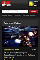
For their mobile website the design has been streamlined significantly. The logo and navigation are much smaller and simplified. The navigation is broken out below the logo now and account management now sits along side it. The main content now fits in to a long central column with more focus on the 'featured' content (in this case a thumbnail leading to a video, with a description). They apply the mobile site by using a subdomain, m.giantbomb.com and this allows them to give people the choice between mobile and desktop layout.
The site is fast, adaptive and efficient. I contacted Dave Snider, one of the main designers for Whiskey Media (the parent company) and asked him about advice he had for mobile development. Here is what he had to say:

"If you're trying to build a site that works across desktop and mobile resolutions you might want to check out some of the fun things that can be done with media queries. The real advice is to just keep it simple. Use flat colors and big buttons."
Very to the point but solid advice none the less, I feel. I will be taking his advice to heart, since the mobile site he helped design is one of the best out there.
Coding
He linked me to a site called Zomigi, which had some very useful tips regarding media queries which can be used to change elements of design by requesting different style sheets dependent on the design etc. It talks through the process of choosing what to eliminate in a mobile design or when designing for different resolutions. It shows how you can deliver different content for different size screens.
Source: http://zomigi.com/blog/examples-of-flexible-layouts-with-css3-media-queries/
I also found another article detailing media queries to produce mobile layouts, which is very interesting.
Source: http://www.smashingmagazine.com/2010/07/19/how-to-use-css3-media-queries-to-create-a-mobile-version-of-your-website/
Design
On the design front, I found a website that contains a showcase of many mobile layout. There is a good variety and gives me plenty of ideas for the potential of my website.
A lot of them feature elements that Dave was talking about. Flat colours and big buttons. This seems the most sensible route.
Source: http://www.lovelyui.com/
Research: Typography in Web Design
I found this very interesting article giving examples of good/interesting use of typography in web design.
Source:
http://www.noupe.com/showcases/the-showcase-of-bold-typography-in-web-design.html
It has given me great ideas about trying to stand out using type. Whether that be in the logo or use of typefaces to distinguish different elements. The article gives a pretty spot on and interesting analysis of what makes these pages good based on their typographical choices.
Some of my favourites:
http://www.denisechandler.com/
The use of typography and illustration really make this stand out as a unique page and immediately hold my interest. There is clearly nothing else like it.
http://www.forefathersgroup.com/
The simplicity of the design here relies on the very ornamental and old fashioned typeface. It isn't too obtrusive though (although rather large) but distinguishes it from modern, more sleek typefaces used on the web.
http://www.richbrown.info/
The typography is very bold, and very high contrast. There is nothing especially fancy going on, it is just simple and bold grabbing your attention without anything visually complex.
http://www.elysiumburns.com/
The use of different typefaces here and especially different sizes helps break this very dense page down in to distinct and manageable sections. Each typeface serves a purpose and looks good individually, but also act as defining it's own section.
Combining Typefaces
Smashing Magazine wrote an excellent article on how best to combine 2 or more typefaces, and giving advice about how best to judge what works well together. I like the concept of juxtaposition, using a serif typeface with a sans serif typeface, and using different weights.
Source: http://www.smashingmagazine.com/2010/11/04/best-practices-of-combining-typefaces/
Analysis: Current Website
I want to build my new website largely off of my existing website, but with considerable improvements based on what I have learned.
Home Page

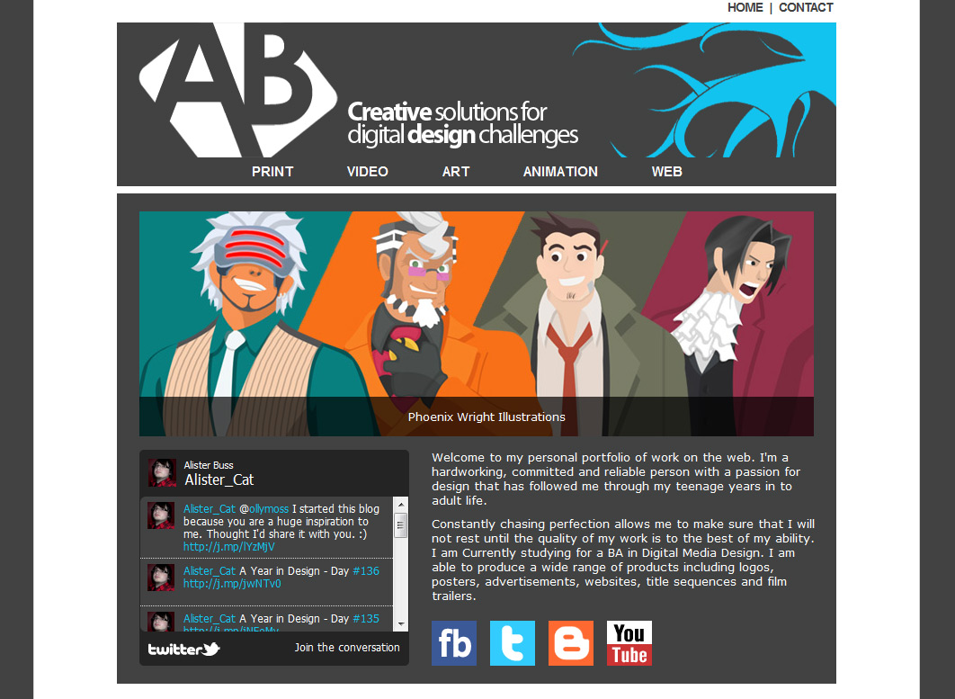
My current home page is sectioned off very distinctly allowing the user to recognize the sections. However, the header is too chunky, as are the icons. Reducing the text might also improve the page. I have placed a feed of my twitter posts on the front page which is something I think I will carry forward on to the new website.
The main feature of the page is the image slideshow. I can create images and place them in the XML and javascript based slideshow code and it will cycle through each image after a couple of seconds. This makes the home page less static as well as giving a broad tour of the work on my website. It is, however, outdated. It is good that it links to the work that is shown and I think I will carry an improved version of this concept on to my new website.
The navigation here is too big, numerous and cluttered. There are a lot of pages I need to cut down on, and I don't need so many drop down menus. It also suggests equality between all of the disciplines on display, which is not accurate (I am not very good at Flash, for example). This will just frustrate and confuse the user. Consolidating content will be my main goal.
Video Pages

As you can see, my video pages are very poorly formatted. A large paragraph of text and then an embedded youtube video. The text is unappealing and it doesn't need to come first. Also, the embedded Youtube video isn't of great quality and it's flash meaning it won't work on Apple devices.
I have thought about using HTML 5 'Video For Everyone', but Youtube have started to support H.264 and on iPhone will redirect to the app or mobile site. Also, I will want to cut down on the amount of videos I have on the site.
Project Pages

My project pages are not formatted to show of the projects themselves. They contain a large preamble in the form of a paragraph of text, and then some small images. I need to structure the page better and put images at the core, that way if people are interested they can read more.
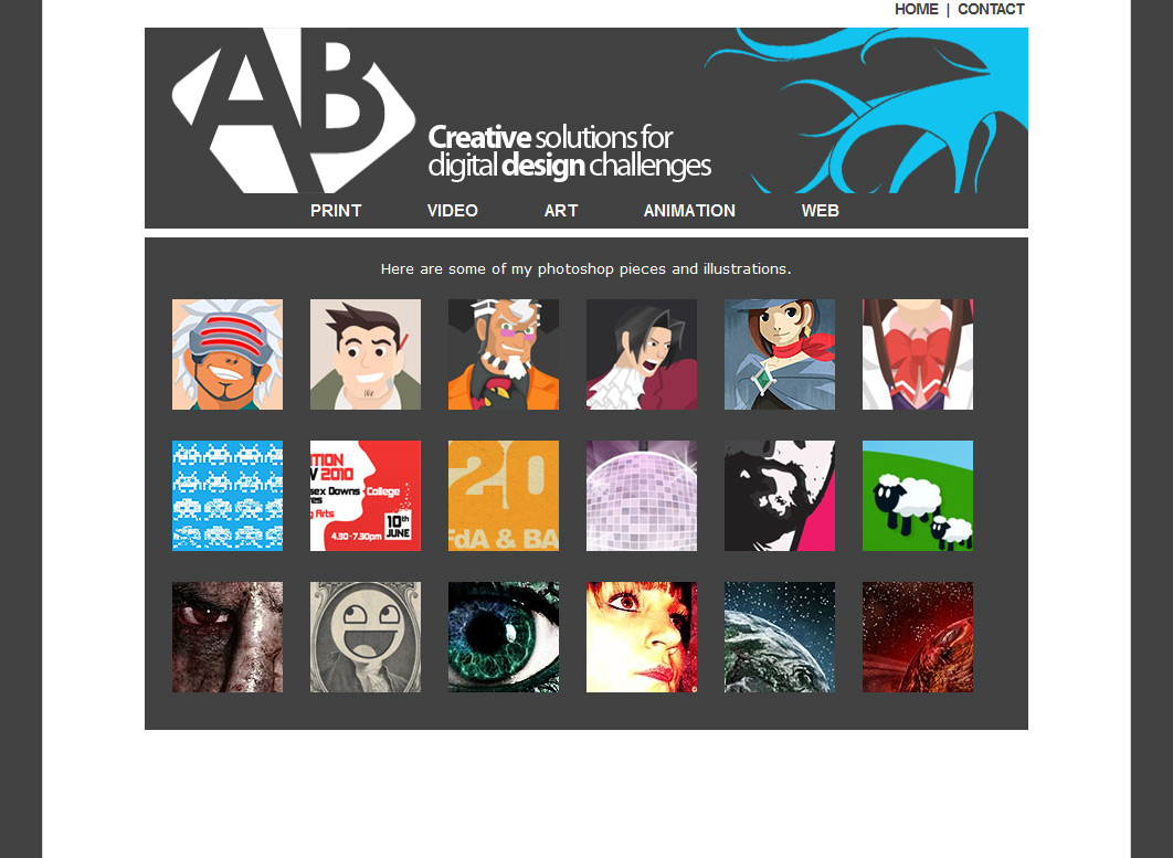
'Art'

One of the worst problems with this page is it's name. I don't do art. It's really all my graphic design and illustration work that doesn't fit anywhere else. I will have to correct this. It needs to be updated with more recent and better images.
Home Page
My current home page is sectioned off very distinctly allowing the user to recognize the sections. However, the header is too chunky, as are the icons. Reducing the text might also improve the page. I have placed a feed of my twitter posts on the front page which is something I think I will carry forward on to the new website.
The main feature of the page is the image slideshow. I can create images and place them in the XML and javascript based slideshow code and it will cycle through each image after a couple of seconds. This makes the home page less static as well as giving a broad tour of the work on my website. It is, however, outdated. It is good that it links to the work that is shown and I think I will carry an improved version of this concept on to my new website.
The navigation here is too big, numerous and cluttered. There are a lot of pages I need to cut down on, and I don't need so many drop down menus. It also suggests equality between all of the disciplines on display, which is not accurate (I am not very good at Flash, for example). This will just frustrate and confuse the user. Consolidating content will be my main goal.
Video Pages

As you can see, my video pages are very poorly formatted. A large paragraph of text and then an embedded youtube video. The text is unappealing and it doesn't need to come first. Also, the embedded Youtube video isn't of great quality and it's flash meaning it won't work on Apple devices.
I have thought about using HTML 5 'Video For Everyone', but Youtube have started to support H.264 and on iPhone will redirect to the app or mobile site. Also, I will want to cut down on the amount of videos I have on the site.
Project Pages

My project pages are not formatted to show of the projects themselves. They contain a large preamble in the form of a paragraph of text, and then some small images. I need to structure the page better and put images at the core, that way if people are interested they can read more.
'Art'
One of the worst problems with this page is it's name. I don't do art. It's really all my graphic design and illustration work that doesn't fit anywhere else. I will have to correct this. It needs to be updated with more recent and better images.
Production Planning: Timeboxing
With a 4 week production timeline I feel the need to plan my actions to fit within this time constraint. I once listened to a talk by the Game Developer 'Double Fine', and they mentioned a concept called 'Timeboxing' for their production process, so I decided to look it up.
Source: http://en.wikipedia.org/wiki/Timeboxing
Although typically associated with software development, it seems an ideal model for me to use over the 4 week production timeline. While not taking the form of boxes, I have drawn up a time table for my sketchbook containing 2 goals (deliverables) per week, all clearly labeled with their due date. The budget does not factor in to my needs so I have omitted it.
This should ensure a tighter work pipeline by allowing me to see at a glance where I should be at any given time.
Timeboxing is a Planning technique common in planning projects (typically for software development), where the schedule is divided into a number of separate time periods (timeboxes, normally two to six weeks long), with each part having its own deliverables, deadline and budget.
Source: http://en.wikipedia.org/wiki/Timeboxing
Although typically associated with software development, it seems an ideal model for me to use over the 4 week production timeline. While not taking the form of boxes, I have drawn up a time table for my sketchbook containing 2 goals (deliverables) per week, all clearly labeled with their due date. The budget does not factor in to my needs so I have omitted it.
This should ensure a tighter work pipeline by allowing me to see at a glance where I should be at any given time.
Final Idea
Having thought of what I'd like to do for this project I decided on an idea, and have had it approved.
Portfolio & Mobile Site
I would like to produce a re-designed portfolio website as well as a mobile website for smart phones.
Here is my project proposal, outlining in more detail what the project is and my reasons for choosing it.
This is my aim, and completing the degree this year means that I will need a strong portfolio in order to start gaining experience in the industry.
Portfolio & Mobile Site
I would like to produce a re-designed portfolio website as well as a mobile website for smart phones.
Here is my project proposal, outlining in more detail what the project is and my reasons for choosing it.
Self Branding
During the course of this year I have covered many interesting types of media and expanded my skill sets. One of the more interesting aspects, however, has been talks from industry professionals. They have talked about how they started out, their industry experience and giving advice.
I made a lot of notes about these pieces of advice and one recurring thing I noticed is about the importance of portfolios, which is a form of self branding. You are selling yourself to design companies, and your portfolio should reflect what you have to offer. My current portfolio was built at a time where I just wanted to have an online presence, but unclear of how to do it. I built a site, put it up and it has been stagnating ever since.
Using the advice and all I have learned in the current academic year I propose a portfolio site to be built by me that incorporates lessons learned regarding self branding, promoting my talents, usability and technical considerations. What I present on my portfolio is also a key aspect. I currently have most of the projects that I am happy to show, presented in an overly cumbersome way. I would like to cut the content down and aim it more towards my interests and abilities.
I also propose a mobile version of my portfolio for smart phones. Something I found very interesting in the academic portion of this year is the proliferation of mobile devices and how it is changing media. The uptake of devices capable of mobile web browsing means that it cannot be ignored and I should aim to deliver an optimal version of my website for the platform. Not only should I have to consider cross browser development, but cross platform as well.
I believe the redesign will be a sufficient creative challenge, and the mobile website will be a significant technical challenge utilising modern languages such as CSS3 and HTML 5.
This is my aim, and completing the degree this year means that I will need a strong portfolio in order to start gaining experience in the industry.
Ideas: Print, Web, Interactive?
Having so much freedom on a brief is both a pleasure and a problem. We have covered so much this year. Interactive applications through processing, videos, virals, motion graphics and I have pursued illustration and print in my personal time. With so many options it is hard to pin down what I want to do.
My initial ideas involve print based work, as this is something I feel I enjoy more than other areas, and would like to expand in to. I have begun developing an idea for a print based campaign against smoking and binge drinking, using art styles based on artists from the 20th century (Saul Bass, for example) and focus on the posters as 'art' rather than authoritative messages.
My theory behind this idea is based on a quote by David Hockney.
Based on my experience with a lot of these posters they often use shock imagery and very bold type demanding certain action. This must work, in it's own way but I would like to try taking a different approach to the problem. Using art would create images that are interesting in their own right, and remembered for being clever, interesting, or just visually appealing and therefore stick in a persons mind because they want to, rather than scaring them.
It has been pointed out to me that I don't have any justification or research for my reasoning, and that I would need to do thorough research in to my target audience. Is this an effective approach regarding young people? I feel it is, but feeling alone is not enough. Not only that, but also print is a medium which has been severely impacted by the digital media revolution, reducing it's impact, people's interest levels in printed media, and the reach of it's content. Most print campaigns also feature digital components, and these do not quite fit in with my ideas.
I have also been thinking about producing something web based, as I find coding relatively pleasing and a website is in a sense interactive, making it slightly more engaging. We have had several speakers come in lately, one of which spoke about UX design (User experience and User Interface) which I found very interesting and I would like to put in to practice.
My initial ideas involve print based work, as this is something I feel I enjoy more than other areas, and would like to expand in to. I have begun developing an idea for a print based campaign against smoking and binge drinking, using art styles based on artists from the 20th century (Saul Bass, for example) and focus on the posters as 'art' rather than authoritative messages.
My theory behind this idea is based on a quote by David Hockney.
"Art has to move you and design does not, unless it's a good design for a bus."
- David Hockney
Based on my experience with a lot of these posters they often use shock imagery and very bold type demanding certain action. This must work, in it's own way but I would like to try taking a different approach to the problem. Using art would create images that are interesting in their own right, and remembered for being clever, interesting, or just visually appealing and therefore stick in a persons mind because they want to, rather than scaring them.
It has been pointed out to me that I don't have any justification or research for my reasoning, and that I would need to do thorough research in to my target audience. Is this an effective approach regarding young people? I feel it is, but feeling alone is not enough. Not only that, but also print is a medium which has been severely impacted by the digital media revolution, reducing it's impact, people's interest levels in printed media, and the reach of it's content. Most print campaigns also feature digital components, and these do not quite fit in with my ideas.
I have also been thinking about producing something web based, as I find coding relatively pleasing and a website is in a sense interactive, making it slightly more engaging. We have had several speakers come in lately, one of which spoke about UX design (User experience and User Interface) which I found very interesting and I would like to put in to practice.
New Project: Independant Project
Unit MUH85 - Independant Project
The brief for this project states that it is to test our ability to work independently. That means very little lecture guidance, and self initiated project creation and development.
This is an opportunity to apply a lot of the things learned throughout the course and very open as there is not a set product or brief. A series of quotes about design have been given about potential starting points. I may use one of these or come up with my own idea entirely.
Video Music Credit
I just need to credit the author of the wonderful music I used in my video.
The song is called 'Cherry Blossom' by Kevin MacLeod, provided royalty free.
http://incompetech.com/m/c/royalty-free/index.html?keywords=cherry&Search=Search
The song is called 'Cherry Blossom' by Kevin MacLeod, provided royalty free.
http://incompetech.com/m/c/royalty-free/index.html?keywords=cherry&Search=Search
Feedback
Showing my work and ideas to Giles I got some good feedback. He said some of my ideas were stronger than others, and that I should cut down the ideas. I have cut it down to my 3 strongest, and Giles agreed that this would make a much stronger impact on the judges than a large list of features.
I found this very useful and have designed my presentation to be short and sweet in order to make more of an impact.
I found this very useful and have designed my presentation to be short and sweet in order to make more of an impact.
Taschen Pitch
I have created a small slideshow presentation. Partly for myself, partly for my lecturers. It helps me outline what I hope to achieve with this redesign and where I am going with the brief.
Here are the slides:


Here are the slides:


Research: Taschen iPad App
Currently Taschen have an iPad app. At first I wondered why they put up the brief if they already had their magazine on the iPad so I decided to take a look and analyse this app to see why they set this brief and what I can do better.
Taschen Magazine Fall/Winter 2010
http://itunes.apple.com/us/app/taschen-magazine-fall-winter2010/id410813800?mt=8
Here is what I found.
I got an iPhone and an iPad for research purposes and used the app and was not impressed. I can see why Taschen set this brief to have the app redesigned. It is not made with tablet devices made in mind at all, really. There is some touch functionality in there but it is essentially the InDesign files for the printed version of the magazine displayed digitally and a clunky, unattractive interface bolted on to it. Possibly the worst thing about it is that there are so many legacy features from print.
They have added page turning animations and 2 page layouts which do not make efficient use of virtual space or tablet devices. The page turning animation is really clunky, heavy to load and worst of all, slow. When I think digital I think fast and this is certainly not at all what I would want out of a digital application. It has given me some really interesting points for how I should tackle my UI design and feature set to almost counteract on what they currently have with their iPad app, one that I think is bad.
Subscribe to:
Posts (Atom)